Key details
Date
- 3 February 2023
Read time
- 6 minutes
Plan B is a two-woman creative studio, founded by Betty Brunfaut and Bakhtawer (Baki) Haider while they were studying MA Visual Communication at the RCA.
Key details
Date
- 3 February 2023
Read time
- 6 minutes

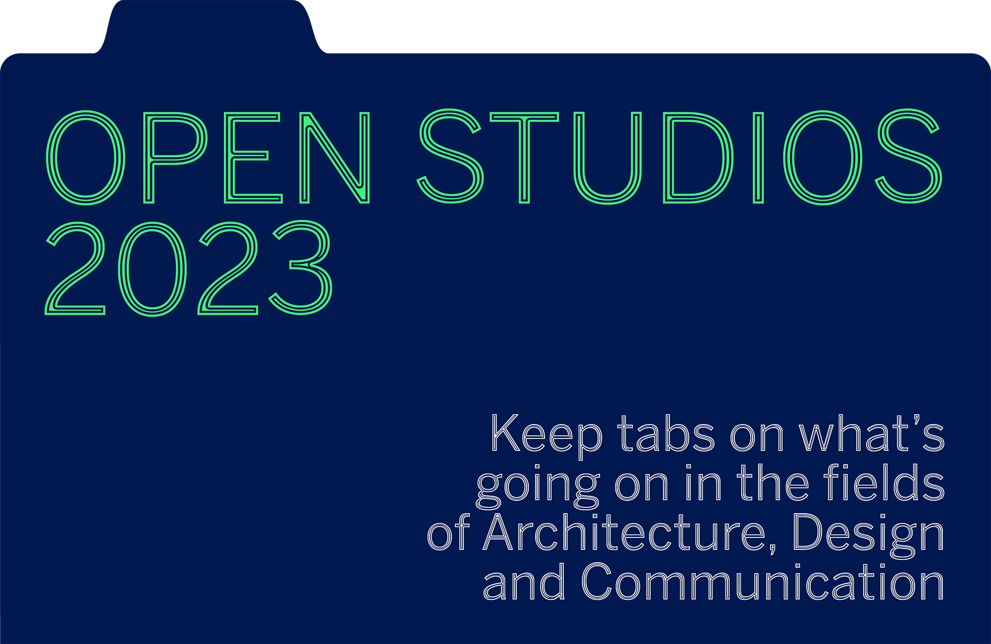
Plan B designed the visual identity for the RCA’s Open Studios 2023, an event showcasing student work-in-progress both in students’ studios at the RCA and online. This involved creating a cohesive visual language for the event, including digital assets for social media, websites and email invitations as well as external signage and internal wayfinding to help visitors navigate the spaces open to the public across three campuses.
Since graduating in 2020 they have worked with clients including London Film Week, the V&A and Science Gallery London and run a publishing house Sold Out. Before coming to the RCA both studied graphic design, Betty at La Cambre, Belgium, and Baki at LCC, UK.
We spoke to them about their sustainable and inclusive approach to design, and the influence the RCA had on establishing their design studio.

What's the concept behind the visual identity for the RCA 2023 Open Studio?
Baki: Our intention was for it to be simple, functional, accessible and as sustainable as it can be…
Betty: … within the time limit we were given, which was quite tight.
Baki: When we were students, the work-in-progress event was an opportunity for people to engage with our work and for us to get some honest feedback. So we started to think about the identity representing this idea of gathering and collecting feedback.
Betty: We were also conscious of it being an open studio format, so wanted it to have the aesthetic of the studio rather than an exhibition.
Baki: With the folders and hole punch elements of the design, we were trying to portray that idea of collecting, or an archive – the process of stacking, bringing things together and making a quick collection.
Betty: We knew that clear wayfinding is very important to the students, so that visitors can find their way around the space. The visual identity needed to be clear and super accessible for anyone who might feel like they don’t belong in the space.
In terms of sustainability, we took Benton Sans, one of the fonts used by the RCA, and created a version that uses less ink when it’s printed [by removing strips from each character so each one is still legible but uses less ink].
Baki: There’s also a modular approach to the wayfinding. We used hooks that can be reused, and put paper signage on top of them, which can then be recycled.
What do you think makes a good visual identity?
Betty: In terms of the RCA Show identity, that is such a hard question, because I don’t think there is one way, there are thousands of ways. That’s the beauty of it, every year is different and that’s something to celebrate.
Baki: More generally, it’s nice to look at an identity and see that someone has thought about accessibility. They’ve thought about which colours will work from an accessible point of view. They’ve thought about how audiences will engage with the wayfinding. They’ve thought about how to make someone feel comfortable before they enter the building or exhibition.
It’s so wonderful when you realise that a designer has found themselves in an uncomfortable situation and is willing to be there, willing to do the extra research to be generous in who they cater for. That sometimes means ending up with an outcome that may not be aesthetically how you’d hoped, but it is inclusive and ethical.

How did you come to form a studio together?
Baki: We pretty much met on the first day at the RCA – we accidentally sat on the same table, Betty told me she was Belgian and I talked about chocolate. And from then on it was good vibes.
We got put in the same classes over and over again and realised it’s easy to work together, it’s really rewarding and fun. We found we had the same approach towards practising graphic design when it comes to values and ethics, but we also had the same balance of interests in wanting to find out how to run a studio.
Betty: We made it official half way through our time at the RCA. We decided to use the rest of our time as a testing ground for the studio.
Baki: We both had a strong understanding of how we don’t want to participate in graphic design. I worked as a designer for two years before the RCA, that’s how I realised I can't work for anyone, I’m not good at taking instructions and blindly following them.
Betty: When you have your own studio you are in touch with the clients, you understand the full spectrum of what you are doing, you’re not just given a task to get on with. There is freedom that comes with that, but also an aspect of wanting to prove something.

Did you find it a smooth transition to working as a studio post-RCA?
Betty: We were basically already running our studio at the end of our time at the RCA.
Baki: I don’t know if smooth is the right word because we were so naive. But because of the pandemic we were stuck at home, we didn’t have much to do, we couldn’t go out and meet friends, we didn’t have jobs. It was kind of serendipitous in a way, all we had was building that studio.
Betty: The pandemic meant we were already working at our own pace on our own things, without an external framework. We already had to make that structure for ourselves, we just continued.
Baki: In part that smooth transition came from not having to worry about money security too much…
Betty: …although we were surviving off our business from the beginning.
Baki: But it’s not like we are supporting anyone else, we didn’t have to pay for our parents or for children... Studios will always tell you how lucky they were, we always say it is privilege, not luck.

What's your favourite or most memorable brief you've worked on?
Baki: It's very varied. You will find a project that is exactly up your alley, but then the process itself is a lot of labour. The projects that we love the outcome of are some of the hardest to achieve.
We genuinely enjoy almost every aspect of our job, to the point where we can’t really put a hierarchy on it. Every day is different and every client is different, and it demands a different challenge. It’s like an actor taking on a different role for different movies, sometimes comedy is better but romance more rewarding; that's really how we see it.
We are always looking for more work. We are really wanting to grow, to introduce people that may not have the access or the privilege that we have, and can contribute in a new and exciting way to the graphic design industry.
Inclusivity and sustainability are two of your guiding principles. How does this manifest in the work that you do?
Baki: Applying the process of culturally decolonising to graphic design is quite exciting because it is so undefined for us. Put simply, we make a conscious effort to include people that don’t have the access that other people have. That can mean anything from finding and collaborating with other women of colour who do not have the means to be in this industry but want to be, or looking at literature that doesn’t have the platform to exist, that’s where Sold Out comes in.
Betty: We created Sold Out because we were frustrated by the lack of diverse references within graphic design. As an industry graphic design is quite backwards in comparison to other design or art disciplines. So we decided to open a publishing house. We only publish references that somewhat relate to graphic design or to the visual communication industry, and decolonial thinking.
Baki: We are still a young studio so we haven’t figured it all out, but it's something we ask ourselves every single day. It's something we educate ourselves about and our clients about, that in itself holds a lot of meaning for us.
Hopefully when people work with us they can tell how much we care and want to figure things out and introduce a different way of practising, not just graphic design, but also studio culture. Because, as Betty said, graphic design is so far behind unfortunately. You can tell that by the demographic, the literature being published, the typefaces that are being used. We’re not rebels, we’re far from that, but we love to critique, not just the industry but ourselves.

Was this critical approach something that was nurtured by your time at the College?
Baki: I was nudged in that direction. I have this nature of thinking “that’s not right, I don’t like that”. Some people would tell you not to complain so much, but at the RCA I was asked to question “why is that?” I was encouraged to start to formulate these thoughts in a certain way that might come across as more welcoming or stimulating. Some of my tutors read me completely right and created a platform for me to be confident in speaking my opinions.
They also allowed us to critique the institution, it makes you realise you are not brainwashed. You can critique the industry or the institution and at the same time thrive in it, that’s quite a great balance to have.
Betty: You are of course encouraged [to have a sustainable practice], but it always depends on what level, there are so many layers. You do sometimes hit walls, it's not always an open door. We did the first ever sustainability report for the RCA, with another classmate Magda Tritto.
Baki: I found that quite enjoyable, the balance of hitting walls, figuring it out as a student, finding out how hard it is to decolonise a curriculum, or be more sustainable. But that enables you to go out into the industry and be better equipped to actually make a change.
That stage of our life now I’m enjoying, the insecurity is fading away and it's starting to feel like we are able to practise what we preach.

